Album Digipak

One of the bands we researched the most to help with our work was Paramore. We got a lot of inspiration for our music video from their video for 'decode'. Things we got from this video were the idea of using an outside area to film in. Some of the shots which we used throughout our music video also came from this video. Other music videos which we got inspiration from were Florence And The Machines 'Rabbit Heart' and Bat For Lashes 'Whats A Girl To Do'.
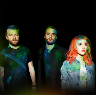
Throughout Paramores work there is a strong brand created. Similar things run throughout their music videos, website and albums. On their website and albums their name is always largely printed so that is is easily recognised. They have a specific font which they use, mainly for their name, on their website and on their most recent album. By doing this it has the potential to make the band more recognisable as it could make people relate the font to the band. After finding this we did it on our work. We displayed our band name at the top of every page on our website and used the same couple of fonts throughout most of our work. At the beginning of some of Paramores music videos such as 'Anklebiters' they display their name and the name of the song. This could make people want to research the band and listen to more of them after they've listened to the song. The band don't really have a specific colour scheme although it is generally darker colours. However in their videos or when doing live shows the two male members of the band tend to wear black clothes where as Hayley, the lead singer, is often seen wearing brighter colours. She is also known for having brightly coloured hair. By doing this they help to make an image for themselves as it makes it more obvious for audiences that Hayley is the lead of the band. The are also often seen wearing quite alternative clothing, which again helps them fit into the genre of alternative rock and pop-punk and helps support their image.
This is a slide show showing the different Pages of the Paramore website. The Paramore website is a very well made website and we got a lot of inspiration from it for our own website. The theme, colours and images used throughout the website are very effective and they stick to the generic conventions of the genre of the band. The website is effective because it allows fans to listen and download music. You are also able to view photos and recent news of the band as well as purchasing the bands merchandise. The 'about' page allows fans to be able to find out more about the band members and the record company, allowing them to be able to get closer to the band and its members. The website also features links to the bands different social media sites, meaning the fans can view the bands on different platforms as well as being able to find out news about the band and seeing what the band is doing. The bands logo of the three bars is also featured widely not only on the website but also on merchandise and music, meaning that the audience now associates the band with this logo more easily.
During research we learnt that it would be important for us to create a recognisable band name and logo. We decided on 'Animal Silence' because we felt it was an easy name for fans to remember and it also fit into our genre of Alternative Rock. We made our logo the bands name on top of a lighting bolt. We again did this because it fits into our target genre but it is also an easily recognisable logo and is also something which hasn't been used before. The name appears on the cover of our album in a bold font. We did this so that the album would stand out and also because it would mean that the album would easily be associated with the band. We decided to make our album self-titled after researching into other bands albums and finding out that it is something which is done quite often. We also decided to print the bands name on some of our merchandise because that would mean the with fans wearing it more people would see the name, giving the potential for our audience to spread further.
Synergy: The interaction of elements that when combined produce a total effect that is greater than the sum of the individual elements.
Synergy is important because it helps a band/artist to create a brand for itself. It also makes them more recognisable to their audience. Throughout our work we have used synergy- we have used the same colours throughout our work (Red, Black and White). Our website also allows fans to purchase merchandise such as T-shirts, Phone Cases and Jumpers. It also has links to tickets so that fans can buy tickets to the bands live shows. The homepage also features our music video so that people have the opportunity to view it as soon as they click onto the website.